We Kiss the Sky: Making philosophy accessible one translation at a time
- Dec 30, 2019
- 3 min read
Updated: Jan 3, 2020

Note, the page owner has made changes since the rework.
We Kiss the Sky (WKS), named for the feeling gained from getting autonomy through critical reflection, offers translations of famous philosophical writings. It repackages academic texts into accessible language in line-for-line translations into common language, Black English, memes, modern-day English, millennial speak, New York City dialects, Southern dialects, and more. WKS doesn't translate texts because it believes that people are incapable of understanding the text in the way that it was originally written, rather it translates texts because people should have the option of reading texts in their own cultural dialects.
We Kiss the Sky, run by PhD candidate Taylor Tates, fights against elitist rhetoric and fights to make philosophy accessible by meeting people where they're at. We Kiss the Sky fights against classist and racist standards of language that places false hierarchies of merit on different methods of communication.
The Website
WKS, while brilliant, was formatted in a way that greatly weighed down the reader through a confusing menu with hidden links, poor labels, and a disorganized layout. There was no structure to the text with countless fonts that were used in reckless abandon, causing no hierarchy on the site, making each page, or even section, a new experience and another structure for the user to learn just to access the writing. The mission of the site was buried and text competed with bold (illegally sourced) images that made it low contrast, hard to read, and a mountain of eye strain.
The brilliance of the site was getting lost in it's lack of structure, clarity, and skim friendly structure.


But isn't WKS against hierarchy?
Sure, it's against hierarchy that's rooted in oppression and false measures of worth. But for layout? Visual hierarchies help users understand how important different information is. It helps guide them through the content and gives structure. This is essential for decreasing the user's cognitive load. They shouldn't struggle to move through your website.
Accessibility
All of these rough moments - moments that are difficult to the user - compound creating a cognitive load. It can undermine credibility, make content more difficult to access, and frustrate users the point that they leave before they even truly engage. But what else?
It can be completely inaccessible for those with disabilities. Poor color contrast, for instance, can be hard for those with visual impairments. Not using header tags also makes it harder for those who rely on screen readers. And this is just the tip of the iceberg. The whole point of WKS is to make content more accessible, not less.
The New Design
With a small amount of budgeted hours, I focused on several key goals:
An intuitive menu layout that sorts sections, has grounded functional content (outlinks, contact information in the footer, etc)
Removing of duplicate pages
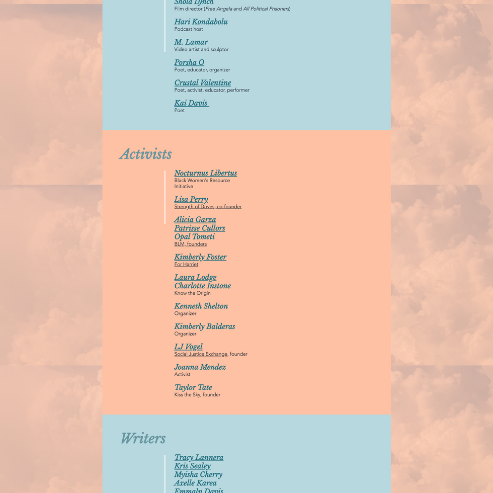
Lessening eye strain by left aligning text (web owner did change some back), making a visual hierarchy of text by using different fonts, sizes, and colors, and creating a solid background that is consistent page to page
Making it more screen reader friendly with Alt Text, AA compliant color contrast for main text, and the use of header text
Sorted lists and columns, clustered content into like groups
Lastly, the client remarked that she frequently received criticism from her colleagues in academia for pursuing this project, yet doubted that they had actually engaged with the content. I worked to create a brand that was warm, inviting, and consistent to build credibility by giving WKS a more visually appealing and polished packaging.
*Note: the background was locked, so the clouds stayed set as the user scrolled. The screenshots poorly reflect that.


Comments